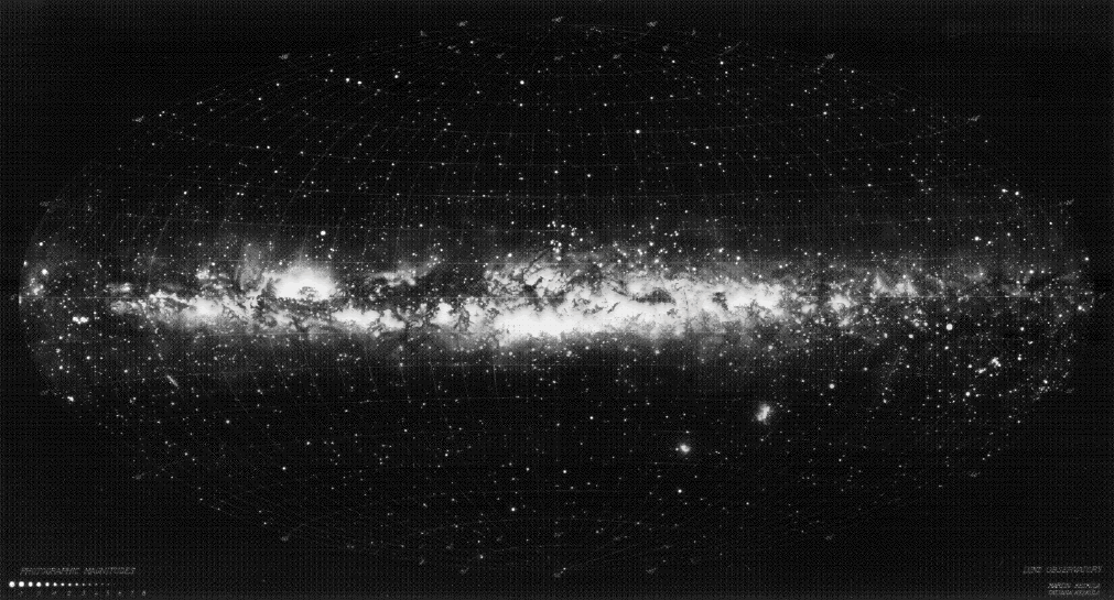
The Lund Observatory illustration of the Milky Way, completed in 1956. The original work is 2m wide. Click image for a larger view - it's absolutely scrumptious.
More Milky Way-ness. Like the Orrery, depictions of the sky above have been something we have really tried hard to encompass. And so I must mention a couple of especially endearing representations...The Lund map of the Milky way (in which you can see the Emu dark cloud constellation quite well) is actually an illustration, even though it looks very much like a photograph. Professor Knut Lundmark, in 1955 or something, had a team of astronomers sit down for what must have been quite some time and accurately map and depict the Milky way for all posterity.
Apparently, upon completion of the grand task, the brighter stars had to be 'mussed up' somewhat and made a little more fuzzy. Though painstakingly accurate in their relative brightness to the rest of the illustration, the closer stars just didn't look right... too pointy and sharp. And so, the astronomers pulled out the 19th century version of the Gaussian blur and made everything a little more misty... less accurate, but more believable...
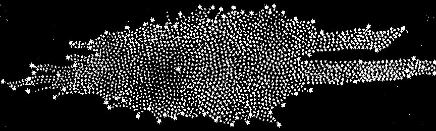
The shape of the Milky Way as deduced from star counts by William Herschel in 1785; the Solar System was assumed near center.
My other favorite depiction of the Milky Way is by William Herschel. When I first saw this I assumed it was from way back, maybe the 13th or 14th century... but no, William made this one in 1785. It is a diagram he made while attempting to count the stars in the Milky way. You may notice that all the stars are all of a rather even amplitude of brightness... it would seem that William had the opposite problem to Professor Lund and his team...

No comments:
Post a Comment